As an experienced professional in the field of User Experience, I genuinely appreciate Quest Diagnostics' meticulous execution of their digital interface for blood draw services, skillfully integrating elements such as online appointment scheduling, reminders, and onsite check-ins.
There is something so delightful about a user experience that is well thought out and supports you throughout the entire process. Being in the UX field for the last 15 years, experiences of products, services, and even spaces are something that I often think about as I navigate life. And it annoys my husband to no end as I go on and on about apps/devices/services that just don’t work well. These things get under my skin, especially because I recognize that often (seemingly) a little effort into UX research and design would have made the thing so much better. It’s often the little annoyances, the experiences that are just a tiny bit off, that bother me the most.
This is interesting to me. I seem to be more attuned to the experiences that don’t work, and I have fewer encounters with experiences that do work. Perhaps sometimes it is, as they say, the best experience is one you don’t even notice (or perhaps, it’s the best interface… anyways, I digress). This is why I’m so pleased to write about an experience that is exciting and pleasurable in the way it works so well. And it’s not just one aspect of the experience. It really is the full end-to-end journey. And, in a true, iterative fashion, the experience has seemed to change and improve over time.
So what is this pleasant and well-designed experience? Getting my blood drawn at Quest Diagnostics. I know. Of all things (I’m sure you’re asking yourself), how can that be a pleasurable experience? It is, because of the support I feel at every step of the journey.
Let’s first start with my expectations. This is, likely, part of why the experience with Quest is so good—I have relatively low expectations for getting my blood drawn due to past experiences. In the past, I found the process was relatively slow; I couldn’t schedule an appointment, meaning when I show up, I may have to wait some amount of unknown time. Once I arrived, it took several steps to check in: writing down my name, waiting, then talking to the in-take staff, waiting again (while terrible day-time television is playing in the background), finally being called to get my blood drawn, and then consuming my lab results via a horribly formatted printout.
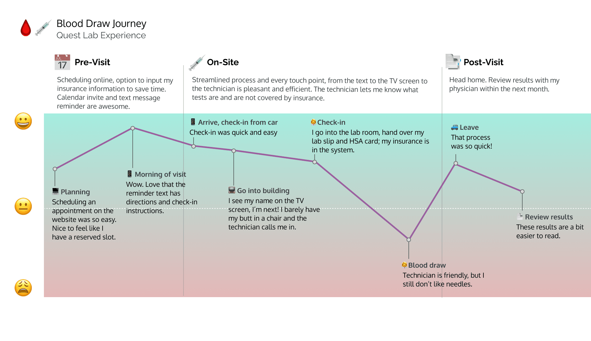
Of course, being a UX person, I figured creating a journey map would help me better understand and convey my experience… so voila! And as you can see, low expectations indeed.

Contrast that with the experience of going to Quest Diagnostics, where they have streamlined and simplified the process to make it as convenient as possible. Plus they’ve added some delightful (ish… you’re still getting stuck with a needle) pieces to the experience.
Let’s dive into the details of the Quest experience.
To start, I can schedule my appointment online using the Quest website, so I already know that I’ll have a minimal wait time. The experience of scheduling is very straightforward and pleasant. I would say it is relatively standard, though aspects of it just “feel better” than other scheduling experiences I’ve encountered. In revisiting the scheduling process to take screenshots for this post, I picked up on a few design elements that I quite like, though I have to say, I hadn’t remembered noting them in previous times I’ve scheduled an appointment. And likely that is the point. The process is so easy and quick, I hardly remember what it’s like. In some ways, those are the best experiences, the ones you don’t even note because nothing impedes you from completing your desired task.
At any rate, something I liked on further inspection is the added details that are given in the step-by-step wizard to note your selections in previous steps. What a great way to provide system confirmation and transparency and reduce the cognitive burden on the user.

Then (again pretty standard) there is a confirmation email sent. Not much to note here, though I honestly don’t know if this is a Gmail perk—regardless, I love the familiarity of the Google Calendar event at the top of the email, and the link to add it to a calendar. There are further details in the email, which frankly, I didn’t read.

The morning of my visit, I received a reminder text with instructions to check in via my phone once I arrived in the parking lot. Additionally, they provide a reminder of the facility’s location and a link to access a map. Great! I appreciate the anticipation that I may have never visited their facility, or at the very least don’t go there often enough to know the way. What a convenience to provide me with a link to directions!

Additionally, I love that they provide the link to check in right in the text. Within the confirmation email, there was information and a QR code provided for check-in at arrival, which, as I mentioned, I didn’t care to read. But they’ve provided another way for me to check-in directly within a reminder communication.
There are a few things that strike me about the elegance of this solution. First, they provide multiple ways for people to check in. Imagine if I didn’t opt-in for text messages, or didn’t have a mobile phone; maybe I’m the type of person who would print out information about my upcoming visit. They’ve covered that type of user and interaction. But they’ve also accounted for (actual) me, who didn’t read the email. Additionally, consider that they could have decided not to develop this additional route for check-in and simply notified me in the text message to refer to my email confirmation for check-in instructions. But they don’t force me to take that extra step to dig through my emails. They provide an easy access method right in the text. They also consolidate and present two pieces of information in one clean text, which I appreciate—I don’t need multiple messages from them. Finally, they support the user who has done no preparation, making it possible to check in on-site (without the text or QR code) and they also accept walk-in appointments. I really love that they have thought of several important user groups/journeys and supported them all.
I will note. The first time I visited their facility, I did get tripped up. I checked in, in the parking lot, but then was confused when I went into the building, as I immediately saw the “check-in here” sign and assumed (who knows why, as the check-in confirmation assured me I was all set) that I needed to check in again. However, the second (and most recent) time I went, the first thing I saw upon entering the building was my name on a TV screen, which immediately let me know that I was already checked in and next in line to be called!

I’m not sure if I just missed that the first time, or if this was an improvement they had made, but at any rate, the experience of seeing my name as confirmation is an excellent example of how system feedback and transparency are so important in supporting the user.
Continuing on with my experience, my wait time was non-existent, barely sitting down before the technician came out and called my name. This brings me to the physical and human aspects of this experience. The Quest lab facility was clean and bright and carried the Quest branding throughout the physical space, going so far as to have “Quest green” nitrile gloves for the technicians! It was a visually appealing and comfortable environment.
The next steps of the process all occur within the same space, enabling me to stay in that space and streamlining the process of ordering the labs, checking insurance, taking my payment, and finally drawing my blood. I don’t need to interact with multiple people or walk to multiple stations. It all happens at once.
The technician was quite friendly, walking me through the process, and notifying me upfron, that one lab wasn’t covered by my insurance. She was even able to tell me the price so that I could make an informed decision (and decline the service). Then I needed to provide my signature and hand over my HSA card. And finally, the blood draw could begin. The whole process took less than 15 minutes, and I was on my way home.
The final touchpoint to this process is receiving the results. In my situation, I review my labs with my physician who has printed them out and she gives me the printout at the end of our appointment. I found it interesting to compare the two printouts (one from the lab I previously went to, and one from Quest). Even the printout has Quest’s branding and in general is better formatted, making it easier to read and understand the results. Related to the formatting, the Quest printout is six pages long, as compared to 20 pages for the prior lab’s results. (Note that I did not consume my lab results via the Quest portal and so it’s not part of the experience I’m commenting on - something for me to follow up with!)

As a whole, this experience with Quest is so impressive considering the omni-channel nature of the process. It involves the website for scheduling, email for confirmation, text for instructions and checking-in, a TV screen for confirmation, the physical design of the space, the human interaction, and finally the physical results. Every aspect of those modalities has been thought through and designed to produce an end-to-end journey where I, as a patient, feel fully supported throughout. I really feel like I am at the center of this experience. What a wonderful feeling!
As a final thought, something that stood out to me when I drew up the journey maps representing my blood draw experience is that the lowest point in the Quest journey was at the point where I was stuck with a needle. Seems like that is as it should be!

My hat is off to the Quest team that designed this experience. I thank you!
