When I started designing dashboards, I was overwhelmed. I've since learned key steps: 1) establish content, info hierarchy & jobs to be done; 2) craft stories with wireframes, layouts & data visualizations; 3) use visual design for values & emotions. Always test with real users & iterate.
Designing dashboards may sound like a daunting task to many designers, at least that was how I felt when I got started. At EchoUser I’ve worked with a few clients on enterprise design projects. When it was time to design a new dashboard, I couldn’t help but procrastinate, stress eat, and pull my hair out. I dare say that dashboards are one of the most complex digital design components. It intertwines all the functions, features, and pages of the entire product; it provides a sneak peek into what the users are about to experience; and oftentimes it offers a birds-eye view of the whole system. It is entirely its own beast.
I’ve made many detours, several mistakes, and experienced occasional success by trial and error during my journey of dashboard exploration. By no means am I an expert in this domain. Yet, I’d like to share a few things that I’ve learned, steps that I’ve taken, and questions that I’ve asked in my struggling design process with fellow designers who may be staring at a blank art board right now, pulling their hair out and struggling with the same problems I’ve struggled with before.
Before we get down to the nitty-gritty, let’s be clear on what you should have done before you start designing:
You’ve done or read a decent amount of user research to understand your users, their pain points and needs;
You’ve developed some thoughts on how the product works as a whole system; and
You’ve sketched some conceptual models or user flows for the system.
We believe in a research-first design approach at EchoUser, and all the design decisions should be based on solid user research. Only when the designer gains a deep understanding of the users and the product as a whole system, will you be able to deliver a dashboard that serves the users’ needs.
Step 1: Start with the content, information hierarchy & jobs to be done
Take a step back and look at the app as a whole system. You want to try to understand what role the dashboard plays in a systematic view and what jobs users are trying to accomplish on the dashboard. It could be one or a combination of the following components:
Navigation or shortcuts to the most commonly used features/pages
Information visualization of what is happening (e.g. performance data)
Anything that needs users' immediate attention (e.g. alerts, system updates, warning)
Lisa Battle summarized the 10 most commonly used dashboard components in her talk at the UXPA International Conference 2016, which are:
alerts
“to-do” items
performance stats
current status
search
task starting points
social components
recent activity
news, events announcements
push content
Her list is by no means exhaustive, but I found it useful as a prompt during user interviews to find out what components were most important to them. It also serves well as a checklist at client check-in meetings to make sure we are not missing anything.

Once you jot down a list of dashboard components, it is time to do an exercise with your product managers, engineers, clients, or stakeholders to co-create an information hierarchy for the different layers of information. Questions to be answered based on user research:
What information do users care about most?
What actions do users want to perform?
If there are different types of users, how might their needs be different? What do they want to see differently?
The information hierarchy diagram below was created for one of my clients and it served as a stepping stone to a low-fidelity wireframe.

Step 2: Craft your stories with wireframes, layouts and data visualizations
Once you get a good sense of the critical content, the next step is to play with the layout and start wire-framing. This is the most challenging step as it is like you are building the bones and muscles from scratch. There could be many different layouts possible, and sometimes it is hard to tell which one works better. My mentor Steve Fadden, who taught me everything I know about UX when I studied at UC Berkeley School of Information, refers to the “one second story” principle: by skimming through the dashboard for just one second, users should be able to quickly grasp a story of what is going on and get a rough sense if anything needs their attention or concern. Ideally, users don’t have to scroll down the page to get the “one second story”, which means you want to put the most important information on the top of the dashboard. Your “one second story” might answer these common user questions:
What is going on?
Has anything changed since the last time I logged in?
Is there anything that needs my immediate attention?
Do I need to worry or be concerned?
Do I need to take any actions?
The information hierarchy that you developed in Step 1 should help answer these questions. Once the users have developed a good picture of the system in their minds, they might want to dig deeper into the data or navigate to other sections of the product. You want to think about the rest of the story you want to provide to the users.
After you answer the “what is your story?” question, you need to figure out how to tell the story. When it comes to the dashboard, it is often a question of what graph will best display the data? Andrew Abela’s diagram, the Chart Chooser (later he created a new version Slide Chooser) could help you decide which chart is a better fit for your data, and Cleveland and McGill’s levels of graphical perception can help you fine tune and choose the appropriate graphical properties that are the most effective way to convey information.

Andrew Abela’s The Chart Chooser. Source: The Extreme Presentation(tm) Method

Cleveland Mcgill’s Graphical Perception. Source: Interaction Design Foundation
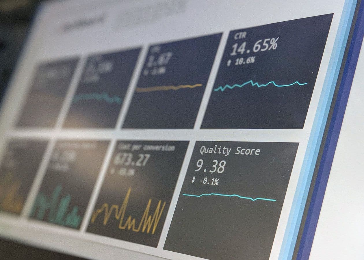
One challenge in dashboard design is information overload. There are two types of information overload: data overloading and non-data overloading. Data overloading is often caused by lack of focus and prioritization. Designers often have to resist the temptation to dump more and more datasets, features, or shortcuts to the dashboard. When the users (and/or clients) describe what they want for the dashboard, the list could get long quickly, making the dashboard a dumping ground before you realize it. If you find yourself struggling with overloaded information, go back to Step 1.
Step 3: Use visual design to convey values and emotions...a harder job than you may think
Visual design is the last step of dashboard design, and here it may introduce the second type of information overload – non-data overload, such as UI decorations, excessive icons, grids, or any other visual elements that don’t represent any content. Edward Tufte referred to them as "chartjunk" in "The Visual Display of Quantitative Information", one of his most famous data visualization books. He acknowledged that “chartjunk” may exist for a reason – either “to make the graphic appear more scientific and precise”, or “to enliven the display”, or to satisfy the designer’s ego by giving the designer himself/herself “an opportunity to exercise artistic skills”. Regardless of its cause, it is the designer’s job to “ruthlessly prune out” unnecessary visual elements to keep the dashboard clean and simple, and let the numbers and content gracefully stand out on their own and serve the users’ needs.
Of all the visual attributes (typography, iconography, illustrations, imagery, etc.), color is probably the most tricky one in dashboard design. Established companies often have well-defined color palettes as parts of their design systems. As a result, designers may not have much freedom to use colors as they wish. Nonetheless, the importance of colors cannot be underestimated in dashboard design.
Color is also a type of information that should be used with purpose. Otherwise it could introduce too much visual noise and become “chartjunk”. Even worse, it could make the information confusing or misunderstood. Certain colors are associated with certain meanings and could bring out certain emotions, not to mention the cultural factors of different color use and interpretations. For instance, in Western culture, most people associate red with alarming, dangerous, and urgent, and think of green as good, healthy, and peaceful. When designers apply colors on the graphics and text, you need to ask questions such as:
Does the value of information match the common interpretation of the color among your users?
Which information is the most critical one that need users attention? - Does the color of the information communicate that urgency?
Are you using the appropriate visual cues such as color hue or color intensity to encode the data?
Does the information involve a positive or a negative notion? Does users’ interpretation of the color match that notion?
Does the color enable efficient comparison of data? Does the grouping of colors follow the Gestalt law of good form, which allows the users to quickly perceive the same color attributes in the same group of information?
As dashboards are often data intensive, they is often color intensive, too. Designers should never underestimate how long it may take your team to reach consensus on the color choices. Leave some buffer time in your visual design schedule. This leeway in project planning could help keep your design projects on track. And don’t forget that colors could be interpreted as a personal and subjective matter. Be well prepared to receive strong sentiments and pushback from others during the visual design iterations. You should always be ready to elaborate on your color choices – what other alternatives you’ve explored, what constraints you’ve considered, and why you reach this design decision.
Test, test and test
In each step of the dashboard design, I cannot emphasize enough how crucial it is to test your design with people - real users - to verify your design assumptions. It is even more crucial with dashboards than the rest of the product, given their design density. There might be tons of use scenarios, and some of them you can only learn by talking to the people who use them on a regular basis. There might be concepts or flows that experienced users have learned to live with but make no sense to new users. Only by talking to the end users who are living in what you design, designers gain a deep knowledge on whether your design makes a delightful experience, and hopefully, improve someone’s lives.
Conclusion
I hope you’ve gained some confidence in dashboard design, and maybe learned something useful. Once you tear down a big design problem into chunks of small design problems, the daunting beast might not be intimidating anymore, and your life might be much easier. Of course there is no one-size-fits-all design solution, I’d love to hear your ideas, comments, and thoughts on what works or not work from your experience.
